


What are some of the different street art styles and techniques that exist?
Some of the many different types of street art are:
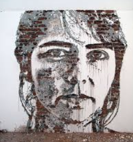
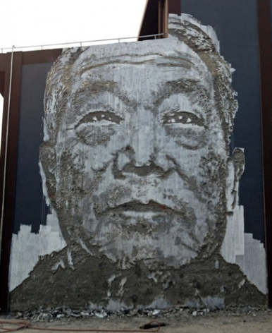
Murals: A very big piece of art painted directly on a wall, ceiling, or another surface like that.


Mosaic tiling: It is based on assembling small pieces of coloured glass, stone, or other materials to create pictures or images.

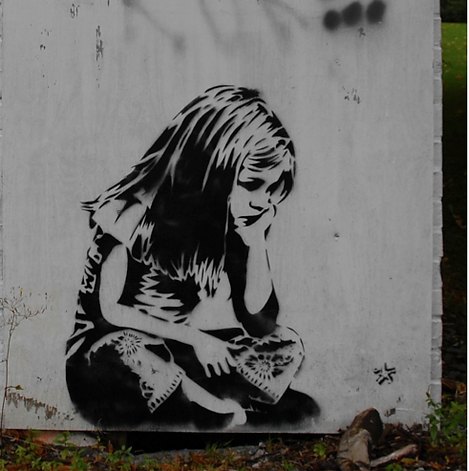
Stencil art: It’s made with stencils, which consist of shapes made out of paper or cardboard. The image is drawn and then cut out, for using spray or roll-on paint for creating the drawing that you want on the surface.

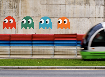
Sticker art: A message or image is displayed using stickers in public spaces.

Wheat paste: It’s an adhesive liquid made from water and vegetable starch used for sticking paper posters to walls or other surfaces.

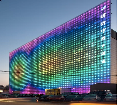
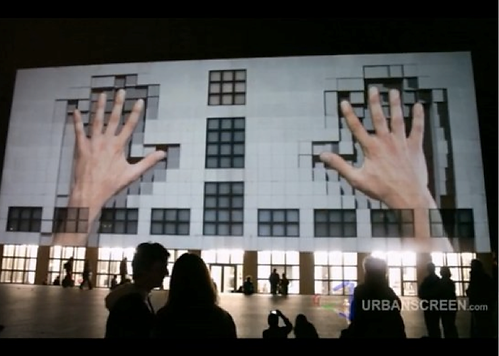
LED Art and video projections: It’s an art form based on light-emitting diodes or projecting video.
Yarn bombing: It uses different types of colourful displays and knitting which are attached to elements in the street such as trees.


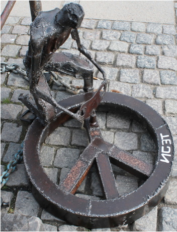
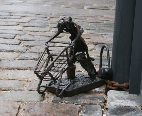
Lock-On: Artists create installations by attaching sculptures to public furniture using chains and old bicycle locks.
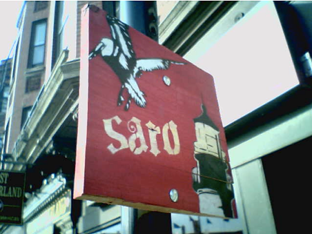
Woodblocking: Artwork painted on a small portion of plywood or similar cheap material and attached to street signposts with bolts that are bent at the back to prevent removal.

Carvings: Destruction as a form of construction, a method that includes etching, scratching, carving and even exploding walls.
ATL skills:
-
Identify problems and develop aims, goals and objectives.
-
Break down large concepts and projects into component parts and combine parts logically as appropriate.
-
Consider all alternatives.
-
Collect and verify data.
-
Locate, organize, analyze, evaluate, synthesize and efficiently use information from a variety of sources and media.
-
Structure information appropriately in in written oral and visual work.
Bibliography:
-
Street Art in terms from the artzine on artrepublic.com. (n.d.). Retrieved November 25, 2014, from http://www.artrepublic.com/art_terms/39-street-art.html
-
Introduction to Street Art Types: A Beginner's Guide How To. (2013, December 9). Retrieved November 26, 2014, from http://vimural.hubpages.com/hub/Introduction-to-Street-Art-A-Beginners-Guide
-
Solana, L., & Carrera, M. (n.d.). Street art. Retrieved November 26, 2014, from http://blocs.xtec.cat/streetart/definition-of-street-art/definitionwhat-is-street-art/
-
9 Different Forms and Techniques of Street Art. (2014, June 9). Retrieved November 26, 2014, from http://www.graffitistudio.net/different-forms-street-art
Theory of colour:
There are various theories when it comes to colour, and they consist of different definitions, concepts, and applications. Some of the most famous ones are the colour wheel, colour harmony, complementary colours, analogous colours, and warm vs. cool colours.
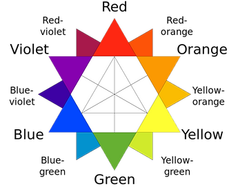

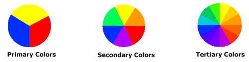
As I just stated one very famous concept is the colour wheel, or the colour circle. It is really traditional in art and it’s simply based on red, yellow, and blue. For instance, Isaac Newton first developed it in 1666 and until today there is debate over which is the best format. It is important to say that some other concepts are attached to this wheel, like the well-known categories for colours as “primary”, “secondary”, and “tertiary”. If the colour wheel was divided only into three parts then the colours that would be left would be red, yellow and blue. These 3 primary colours are really special since they cannot be formed or mixed by any combination of other colours, and all other colours are derived from them. After them, the secondary colours come in and these are green, orange, and purple. It is important to remember that mixing one primary colour with another is what forms secondary colours. Lastly, there are also tertiary colours, and they are yellow-orange, red-orange, red-purple, blue-purple, blue-green & yellow-green. Their names are two-word names (of some other colours) and it is this way because they’re formed by mixing together a primary and a secondary colour beside them in the colour wheel.
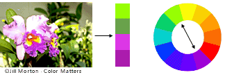
Now that the colour wheel was briefly explained, there is another theory and it is about complementary colours. They usually work well together since they are able to create harmony and balance by “cancelling each other’s hue”. In other words this means that it creates something pleasant for people’s eyes and generates an inner sense of order. Complementary colours are any two colours that directly oppose each other in the colour wheel, like orange with blue or green with red. In the following image it is seen how red-purple works with yellow-green, and it as an example of harmony in nature. These opposite colours are able to create a huge contrast in a really stable and beautiful way.
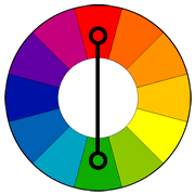
However colours do not need to be complete opposites for creating a good effect, there is also another theory known as analogous colours. Here the colour wheel applies again and analogous colours are the ones that are close to each other. For example in the followinf picture there are 3 colours (green, yellow-green, and yellow) that are side by side in a 12-part colour wheel. The last thing to say about this theory is that with analogous colours, one colour tends to predominate and the combination of them has the effect to create a certain feeling and mood.


Finally, the last theory I consider really important is about “warm” and “cool” colours. Warm colours consist of red, orange, and yellow (plus the combinations within them), while cool colours consist of Blue, violet, and green (as well as the combinations within them too). Warm colours tend to be more active, stimulating, and energetic, unlike cool colours that are usually more calming, relaxing and chill. For this reason warm colours can be more “active” in art and cool colours can recede in the background. If we think about it, this theory is similar to the one of complementary colours, because warm and cool colours are in different sides (not necessarily completely opposite) of the colour wheel. If this theory is used correctly and you vary the levels of intensity in your works of art then you can have lots of benefits. You can manipulate what the viewer looks, create a greater balance, an easier colour harmony, and you can give importance to particular elements if you want.

Apart from what was mentioned there are much more theories and ways to combine colours, but those were the most common and important ones I found. However these are some other examples (without an explanation like before), on how you can use the colour wheel:

Triad

Split-complementary

Rectangle (tetradic)

Square
ATL skills:
-
Use multiple processes and diverse perspectives to explore alternative solutions.
-
Consider all alternatives.
-
Find and select information via different media
-
Collect and verify data.
-
Make connections between random things.
-
Locate, organize, analyze, evaluate, synthesize. and efficiently use information from a variety of sources and media.
Bibliography:
-
Basic Color Theory. (n.d.). Retrieved February 2, 2015, from http://www.colormatters.com/color-and-design/basic-color-theory
Kim, E. (2013, November 26). Street Photography Composition Lesson #12: Color Theory. Retrieved February 2, 2015, from http://erickimphotography.com/blog/2013/11/26/street-photography-composition-lesson-12-color-theory/
Kemp, W. (2011, June 21). How to balance warm and cool colours. Retrieved February 3, 2014, from http://willkempartschool.com/how-to-balance-warm-and-cool-colours/
Color Harmonies. (n.d.). Retrieved Febrary 3, 2015, from http://www.tigercolor.com/color-lab/color-theory/color-harmonies.htm